Data visualization is critical to scientific research because it allows for more efficient exploration and communication. The release of GCEN does not include a plotting program since GCEN focuses on efficiently using gene co-expression network to predict gene function. However, we did not ignore biologist's plotting demands, and we provide a number of data visualization demos and scripts on our website. A successful visualization conveyed a large amount of data in an informative and concise manner remains a challenge, and requires clear objectives and improved implementation. We do not offer automatic plotting, instead of enlightenment to show biological significance in gene-coexpression analysis.
Network degree distribution
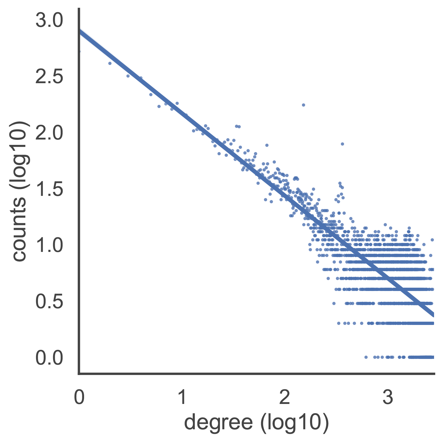
The figure on the left shows degree distribution of gene co-expression network. The degree of a node is how many connections it has to other nodes within the network. If a gene has 10 co-expressed genes in a gene co-expression network, then its degree is 10. The degree distribution of gene co-expression networks is similar to that of scale-free networks and approximately follows a power law. The majority of genes are related to a small number of other genes, while just a few genes are linked to a large number of genes. This degree distribution can be shown as a straight line on a log-log plot.
import pandas as pd
from collections import Counter
from math import log10

import seaborn as sns
import matplotlib.pyplot as plt

# read network
network = pd.read_csv("gene_co_expr.network", header = 1, sep= '\t')
node = network.iloc[:,0].append(network.iloc[:,1])
node_degree = pd.Series(Counter(node))
distribution = pd.DataFrame(list(Counter(node_degree).items()))
distribution = distribution.applymap(log10)
distribution.columns = ["degree", "counts"]

# plot
sns.set(style="white", context="talk")
fig, ax = plt.subplots()
fig.set_size_inches(8, 8)

g = sns.lmplot(x="degree", y="counts", data=distribution, scatter=True,
               markers='.', scatter_kws={"s": 10})
g.set_axis_labels("degree (log10)", "counts (log10)")
g.savefig('network_degree_distribution.pdf', format='pdf', bbox_inches = 'tight')
Sub Network
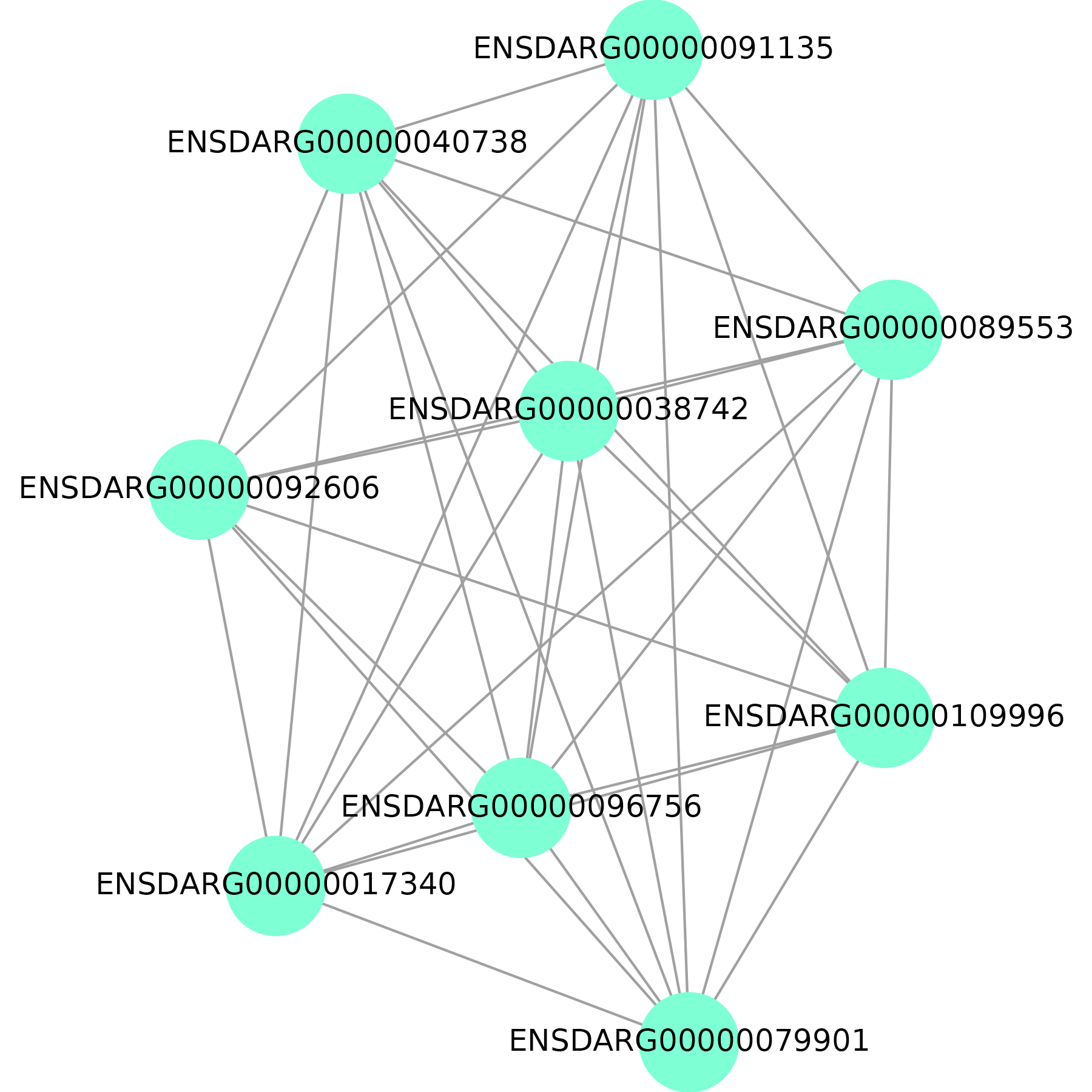
The figure on the left shows sub-network or module. We predict gene function based on neighboring genes in the network or genes in the same module. As a result, it's critical to demonstrate them graphically.
import networkx as nx
import matplotlib.pyplot as plt

import matplotlib as mpl
mpl.rcParams['pdf.fonttype'] = 42

network = nx.Graph()
with open('sub.network', 'r') as network_file:
    for line in network_file:
        node_a,  node_b = line.strip().split('\t')[:2]
        network.add_edge(node_a, node_b)

f = plt.figure(figsize=(6, 6))
f.tight_layout()
nx.draw(network, with_labels=True, edge_color='grey', node_color='aquamarine', node_size=1500)
xl, xr = plt.xlim()
plt.xlim(xl - 0.45, xr + 0.45)
plt.savefig('subnetwork.pdf', format='pdf')
GO annotation counts
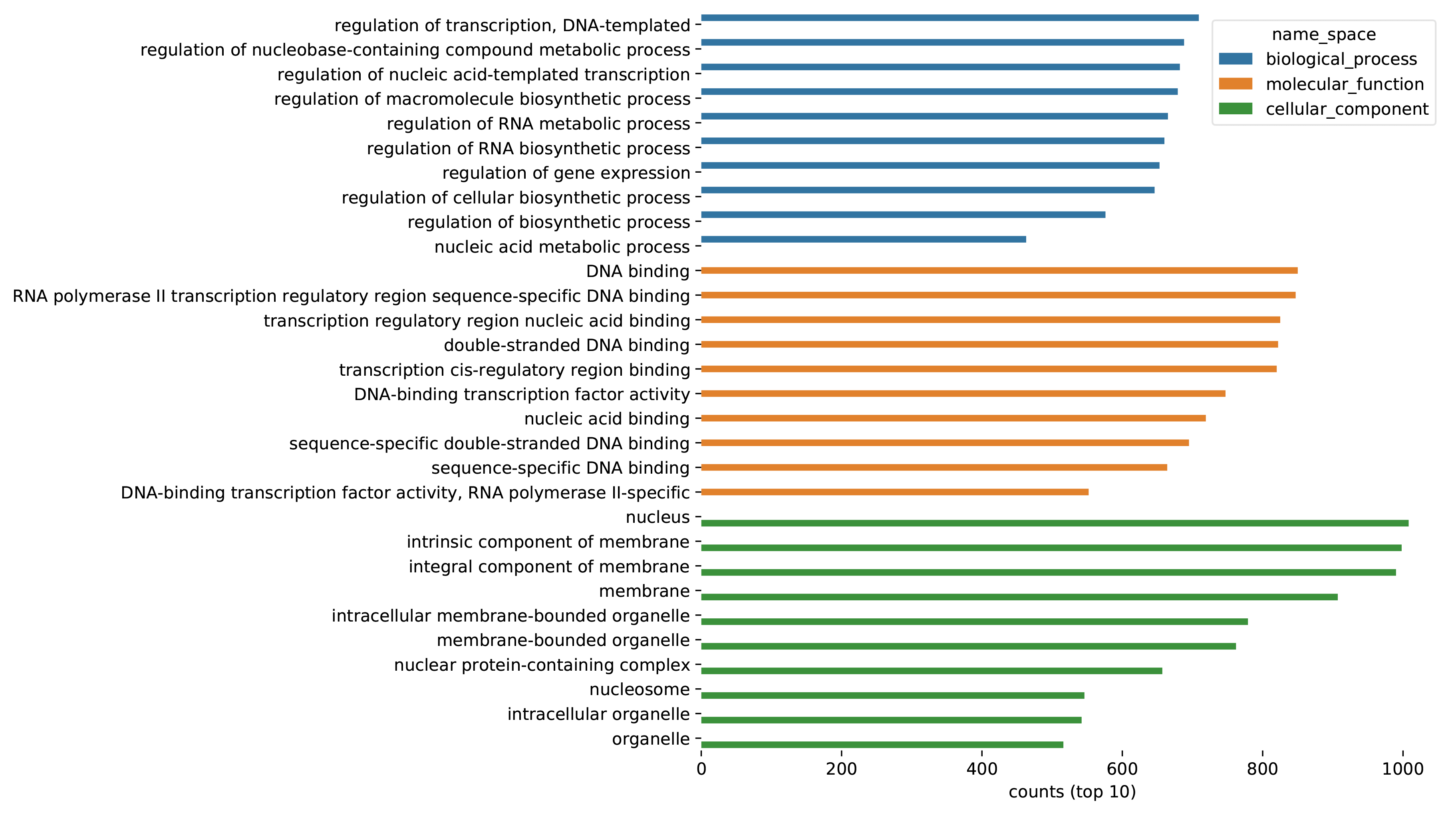
The figure on the left shows the statistics of GO annotations for all predicted genes.
import os
import pandas as pd
from collections import Counter
import seaborn as sns
import matplotlib.pyplot as plt

def read_go(go_annotation_file):
    df = pd.read_csv(go_annotation_file, delimiter = "\t")
    df = df[df['enrichment'] == 'e'][['name', 'name_space', 'p_val']]
    df2 = pd.DataFrame(columns=["name", "name_space", "p_val"])
    for name_space in ['biological_process', 'molecular_function', 'cellular_component']:
        df_ = df[df['name_space'] == name_space]
        df_ = df_.sort_values(by='p_val')
        if df_.shape[0] > 10:
            df_ = df_.iloc[0:10]
        df2 = df2.append(df_)
    return df2

df = pd.DataFrame(columns=["name", "name_space", "p_val"])
for go_annotation_file in os.listdir('network_go_annotation'):
    single_df = read_go('network_go_annotation/' + go_annotation_file)
    df = df.append(single_df)

df_plot = pd.DataFrame(columns=['name', 'counts', 'name_space'])
for name_space in ['biological_process', 'molecular_function', 'cellular_component']:
    counter = Counter(df[df["name_space"] == name_space]["name"])
    df_ = pd.DataFrame.from_dict(counter, orient='index').reset_index()
    df_.columns = ['name', 'counts']
    df_ = df_.sort_values(by='counts', ascending=False)
    if df_.shape[0] > 10:
        df_ = df_.iloc[0:10]
    df_['name_space'] = name_space
    df_plot = df_plot.append(df_)

fig, ax = plt.subplots()
fig.set_size_inches(8, 8)
sns_plot = sns.barplot(x="counts", y="name", hue = "name_space", data=df_plot)
ax.set(ylabel="", xlabel="counts (top 10)")
sns.despine(left=True, bottom=True)
plt.savefig('go_annotation_counts.pdf', format='pdf', bbox_inches = 'tight')
GO annotation (Biological Process top 10)
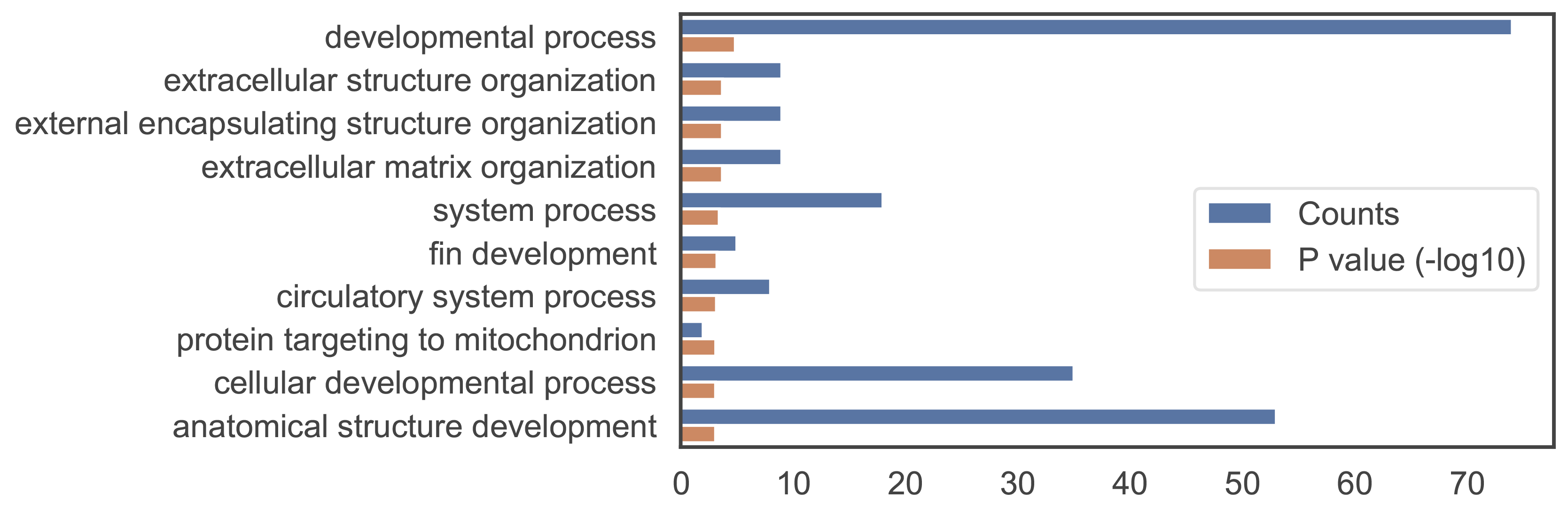
The figure on the left shows GO annotations of a gene. Among the three aspects of gene ontology, the biological process is the most representative of gene function and is also the most demonstrated.
from itertools import islice
from math import log10
import pandas as pd
import seaborn as sns
import matplotlib.pyplot as plt

data_list = list()
with open('module_10.go','r') as go_annotation_file:
    for line in islice(go_annotation_file, 1, 11):
        items = line.strip().split('\t')
        term = items[1]
        count = int(items[3])
        pval = -log10(float(items[7]))
        data_list.append([term, count, 'Counts'])
        data_list.append([term, pval, 'P value (-log10)'])

df = pd.DataFrame(data_list)
df.columns = ["term", "value", "type"]

fig, ax = plt.subplots()
fig.set_size_inches(8, 4)
sns.set(style="white", context="talk")
current_palette = sns.color_palette()

g = sns.barplot(y="term", x="value", data=df, hue="type")
ax.set(ylabel="", xlabel="")
g.legend(loc='center left', bbox_to_anchor=(0.57, 0.48), ncol=1)

plt.savefig('go_bp.pdf', format='pdf', bbox_inches = 'tight')